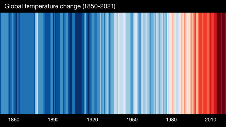
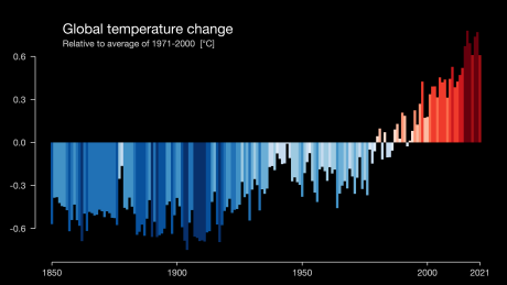
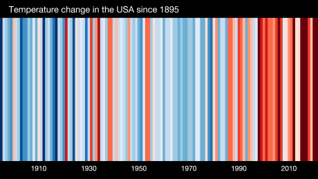
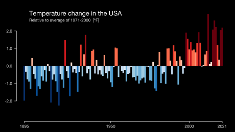
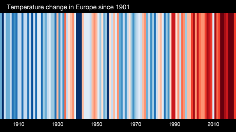
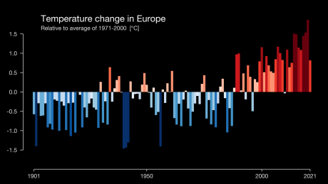
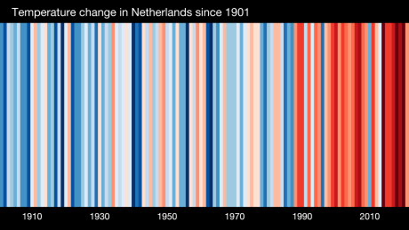
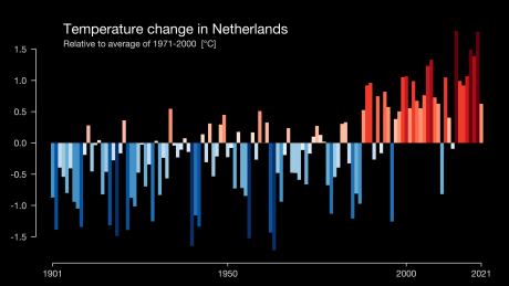
Warming Stripes
Pictures speak louder than words. Climate change visualized with 'warming stripes'.
The color of each stripe in the pictures represent the average temperature of a year, showing clearly that the temperature is on the rise in the last 2 or 3 decades.
Watch the explanation about 'warming stripes'
by Ed Hawkins, professor of climate science
at the University of Reading, UK.
Check out the 'warming stripes' for your country at:
Climate spiral by NASA:
Worldwide climate change over the years in colors: